
Business Card Printing in Delhi: Materials, Finishes and What Makes a Card Worth Keeping
Ektta Jain
Founder, RoboSouls •
Executive Summary
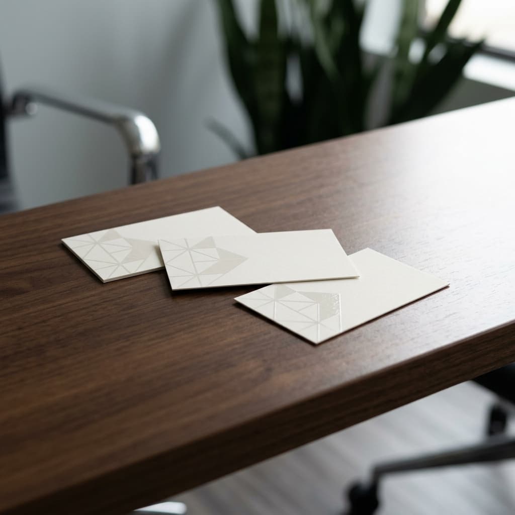
A business card is judged almost entirely by touch, in about two seconds. The decisions that produce that impression are stock weight and construction (300–400 GSM single ply, or duplexed for greater thickness), surface finish (soft-touch or velvet lamination being the most tactile), and one contrast effect such as spot UV, foil stamping or letterpress. Edge painting, die-cutting and unusual substrates go further. Standard trim in India is 89 x 51 mm, though 85 x 55 mm is also common.
Key takeaways
- Below 300 GSM a card reads as flimsy. Most premium cards sit between 300 and 400 GSM.
- Duplexing bonds two sheets together, giving thickness beyond what a single sheet can offer and allowing a coloured core.
- Velvet and soft-touch lamination produce the strongest tactile impression and the weakest resistance to marking.
- Spot UV and foil only register against a matte or soft-touch base. On gloss they largely disappear.
- Uncoated stock is the only common choice that can reliably be written on with a pen.
1. Size and Format
Key Takeaway
89 x 51 mm is the most widely used trim in India, with 85 x 55 mm also common. Both fit standard cardholders; unusual formats often do not.
Two sizes dominate Indian business card printing and either is a safe default. The practical argument for staying close to standard is that cards are stored — in wallets, cardholders and desk files — and a card that does not fit is a card that gets discarded or bent. Square cards, mini cards and folded cards all exist and all attract attention, which is precisely their point, but the trade-off is real and should be a deliberate choice rather than an aesthetic whim. Vertical orientation is a lower-risk way to stand out, since it keeps standard dimensions while looking distinctly different in a stack. Folded cards are worth considering where more information genuinely needs to travel with the card, but they are twice the thickness in a wallet.
2. Stock Weight and Duplexing
Weight is the property people register first, before they have consciously looked at the card. Below 300 GSM the card flexes in the hand and reads as disposable. Between 300 and 400 GSM sits the great majority of professional work. Above 400 GSM a single sheet becomes difficult to cut cleanly, so extra thickness is usually achieved by duplexing instead: two sheets bonded together, sometimes three, producing a card of substantial calliper with a visible sandwich edge. Duplexing also allows a coloured core — a thin sheet of contrasting stock between two outer layers, showing as a coloured line along the cut edge — which is one of the more elegant details available and costs less than it appears to. Triplexed cards with a coloured middle are a common premium specification.
| Construction | Typical calliper | Character | Notes |
|---|---|---|---|
| 300 GSM single ply | Standard | Professional baseline | Adequate for most business use |
| 350–400 GSM single ply | Noticeably thicker | Premium | Practical upper limit for single sheet |
| Duplexed (2 ply) | Substantial | Distinctly premium | Visible edge, allows different faces |
| Triplexed with coloured core | Very substantial | Statement | Coloured line visible along the edge |
3. Coated, Uncoated and the Writing Problem
Surface choice determines both how the card looks and one very practical property. Coated stocks hold ink on the surface and give sharper detail and stronger colour, which suits cards carrying imagery or a saturated brand colour. Uncoated stocks absorb ink into the fibre, producing a softer, warmer result with slightly muted colour, and they have one advantage that matters more than people expect: you can write on them. A ballpoint or fountain pen simply will not take on a laminated coated surface, so if there is any expectation of adding a note to the card — a personal number, a follow-up date — uncoated is the only reliable choice. Textured and cotton stocks extend the uncoated direction further and pair particularly well with letterpress and blind embossing.
4. Lamination: Velvet, Matte and Gloss
Key Takeaway
Velvet and soft-touch lamination give the most distinctive hand-feel. They also mark most readily, particularly on dark colours.
Lamination is a film bonded to the printed sheet, and on a business card its main job is tactile rather than protective. Soft-touch and velvet laminations produce a surface with a suede-like drag under the fingers that is unmistakable and is the reason they have become the default for premium cards. The trade-off is that they hold fingerprints and scuff more readily than any other finish, and the effect is most visible on dark, heavily inked cards — a black velvet card looks superb when new and shows every handling mark. Matte lamination gives much of the restraint with better resistance. Gloss maximises colour depth and is the toughest, but reads as less considered in most contemporary identity work. Whichever is chosen, lamination on a card must be applied to both sides or the card will curl.
5. Contrast Effects: Spot UV, Foil and Letterpress
One contrast effect, chosen well, does more than three competing for attention. Spot UV applies high-gloss coating to selected areas and works entirely by difference — it needs a matte or soft-touch base to register, and applied over gloss it is nearly invisible. Raised spot UV builds the coating so the effect is felt as well as seen. Foil stamping presses actual metallised film onto the card and is the only way to achieve genuine metallic shine; it suits a logo or monogram and dislikes gradients and hairline strokes. Letterpress presses inked type into a thick soft stock, leaving a visible impression — it is the most tactile option available and requires uncoated cotton or similar stock to work, since a laminated surface will not take the impression. Blind embossing and debossing change the shape of the card with no ink at all, which is the most understated treatment available and also the least visible in a photograph.
- Spot UV: needs a matte or soft-touch base; use raised spot UV for a tactile as well as visual effect.
- Foil stamping: genuine metal shine, solid shapes only, no gradients.
- Letterpress: deep tactile impression, requires thick uncoated stock, cannot be laminated.
- Blind emboss or deboss: no ink, purely structural, beautiful in hand and near-invisible on screen.
6. Edge Treatments
The cut edge is a surface most cards ignore and it offers two treatments that are disproportionately memorable. Edge painting applies colour to the four cut edges of the card, which reads as a coloured frame when the card is held and as a solid block of colour when cards are stacked. It works best on thick or duplexed stock, where there is enough edge to see. Edge gilding uses foil rather than paint for a metallic edge. The second treatment is die-cutting: rounded corners are the most common and change the character of a card noticeably for very little cost, while custom die-cut shapes and cut-out details go considerably further. Rounded corners have a practical benefit too, since square corners are what typically get dog-eared in a wallet.
7. Specifying a Card That Works
The most common mistake in business card specification is layering effects until they compete. A card with foil, spot UV, edge painting, a die-cut corner and a duplex core is not five times as impressive as a card with one well-chosen treatment on good stock — it usually reads as trying too hard. The stronger approach is to make the stock and finish carry the quality, then add a single contrast effect on the element that matters most, which is almost always the mark rather than the contact details. Practical constraints deserve a check as well: the type size must remain legible, the card should still fit a cardholder, and if anyone will need to write on it, lamination is ruled out.
8. Artwork Requirements
Business cards are small, which makes the mechanical tolerances proportionally more significant than on larger work. A 2mm shift on a poster is nothing; on an 89mm card it is visible. Bleed and safe zone therefore matter more, not less, and text sitting close to the trim is the single most common artwork problem on cards.
| Requirement | Specification |
|---|---|
| Colour mode | CMYK, with any brand Pantone defined as spot |
| Resolution | 300 PPI at final size; logos as vector |
| Bleed | 3mm on all four edges |
| Safe zone | 3–4mm inside trim for all text |
| Small text | 100% K only, never rich black |
| Spot UV / foil | Separate named spot layer, set to overprint |
| Fonts | Outlined |
| Rounded corners | Supply the corner radius with the artwork |
Summary Overview
A business card is assessed by touch before it is read, which makes stock and finish the decisions that matter most. Get the weight above 300 GSM, choose a surface that suits how the card will be used — including whether anyone needs to write on it — and add one contrast effect on the mark rather than several across the card. Restraint on good material reads as considered; accumulation on thin stock does not.
Frequently asked questions
What GSM should a business card be?
Most professional cards sit between 300 and 400 GSM. Below 300 GSM the card flexes and reads as disposable. Above 400 GSM a single sheet becomes hard to cut cleanly, so additional thickness is normally achieved by duplexing two sheets together rather than using heavier stock.
What is a duplex business card?
A card made by bonding two sheets of stock together, producing greater thickness than a single sheet allows and a visible layered edge. Triplexing adds a third, often a contrasting colour in the middle, which shows as a coloured line along the cut edge.
What is the standard business card size in India?
89 x 51 mm is the most widely used, with 85 x 55 mm also common. Both fit standard cardholders and wallets. Unusual formats attract attention but risk being discarded or bent, so they should be a deliberate decision rather than an incidental one.
Can you write on a laminated business card?
No, not reliably. Ballpoint and fountain pen will not take on a laminated surface. If there is any expectation of writing on the card, specify an uncoated stock with no lamination — it is the only common finish that accepts pen consistently.
Does velvet lamination show fingerprints?
Yes, more than any other common finish, and most visibly on dark cards. It is the trade-off for the distinctive suede-like feel. Matte lamination gives much of the same restraint with noticeably better resistance to marking.
What is letterpress printing on business cards?
A process that presses inked type and images into a thick, soft stock, leaving a visible physical impression in the surface. It is the most tactile card treatment available. It requires uncoated cotton or similar stock with enough give to hold the impression, and cannot be combined with lamination.
Technical Consultation
Need specific specifications for your project?
Send us the format, quantity and finish you are considering, and we will come back with a specification and a quote. Production runs to a 72 hour turnaround.